We were asked to make a magazine spread design based on the Documentary Film "Helvetica" by Gary Hustwit that was about the history of the font Helvetica and how it became to be.
With the use of Adobe Photoshop, I was able to edit the images inserted in the spread. I used Adobe Illustrator and experimented with the layout to give a swiss design feel.
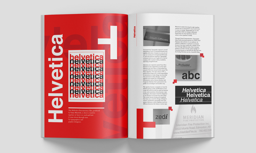
Some of the things I did was, that I utilized the "H" as borders or edges to add visual interest and I added a large but subtle "Helvetica" text on the background to add texture and depth to it so it won't be too plain and to complete the look.
I wanted to layout "Helvetica" to showcase how it looks in different styles - bold, italic and regular styles - found on the right side of the spread. Designing with text is very challenging and I learned to effectively layout text with the use of typography.